Colour psychology in fashion: how colour shapes a buyer's decision
Customers look at a garment's colour first. Knowing which feeling a colour evokes matters for the collection, the window and the content alike.
A customer walking into a store or scrolling an Instagram feed notices a product's fabric, cut and price later. First they see the colour. That makes colour the most powerful tool in fashion marketing — and one that is often used without much thought.
Colour meaning depends on culture
Colours have no universal meaning. The same colour is perceived differently in different countries, age groups and contexts. The associations below are widely held in Western and local fashion markets — not hard rules.
Key colours and associations
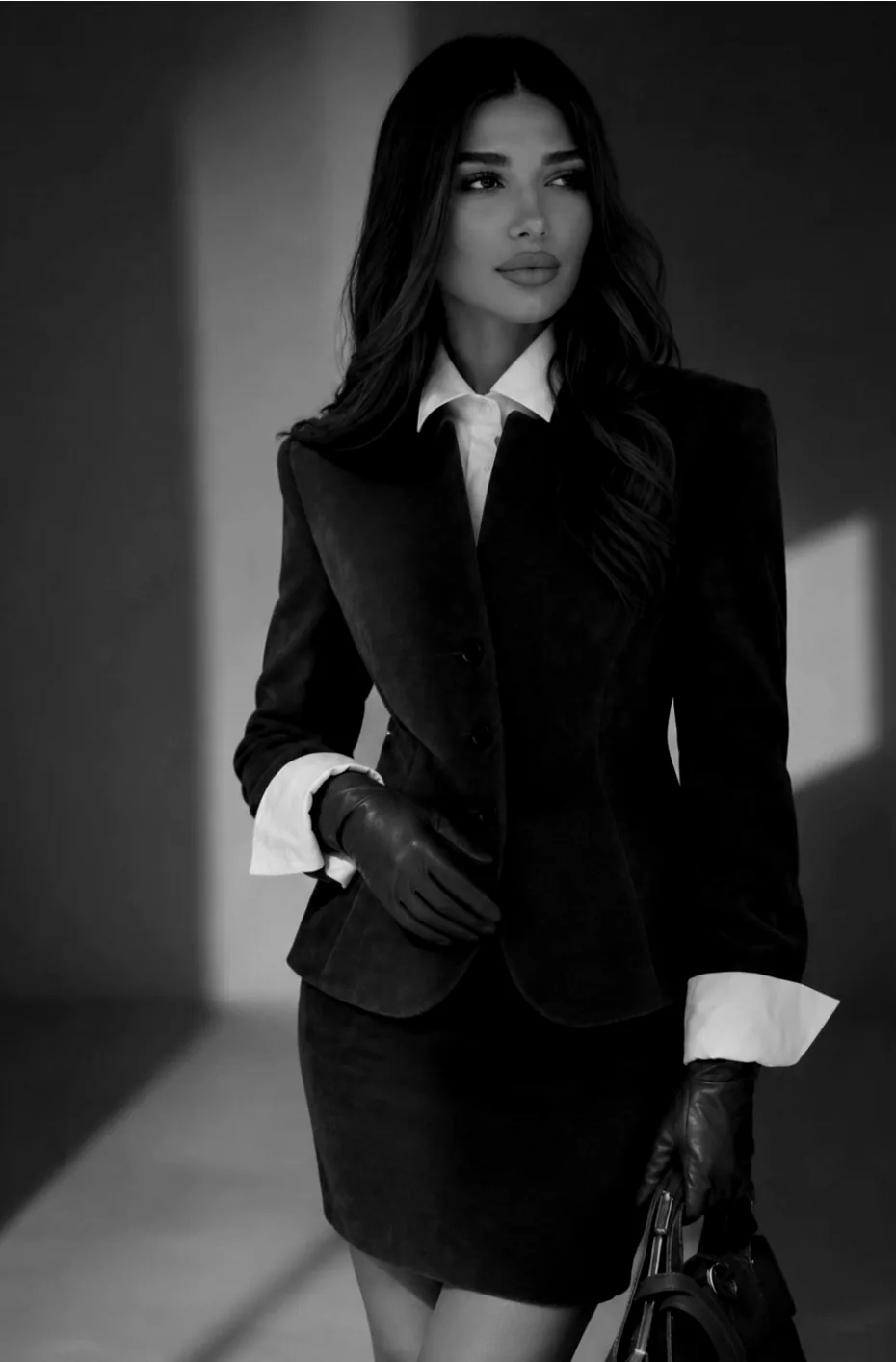
- Black: elegance, power, simplicity, the choice "you can't get wrong". The safest colour in eveningwear and officewear.
- White: purity, freshness, minimalism. Essential in summer collections and the bridal segment.
- Beige and brown tones: calm, quality, the "quiet luxury" aesthetic.
- Red: energy, boldness, attention. Used sparingly, it's the strongest accent in a window.
- Blue and navy: trust, stability. One of the best-selling tones in menswear and classic wardrobes.
- Green: nature, freshness; in recent years associated with sustainability.
Pantone's "Colour of the Year"
Since 2000 Pantone has announced a "Colour of the Year" every year, and the fashion and design industries follow it closely. The choice shows up as a trend in collections, accessories and window design. But for a brand the key question is: does this colour suit my audience?
How to use colour in the store
- Colour blocking: grouping one colour family together makes the rail look tidier and makes choosing easier.
- Light-to-dark rhythm: the eye moves comfortably from light tones to dark ones.
- Accent colour: one bright colour among neutral rails pulls attention to the centre.
For Instagram and online sales
A consistent colour palette across the profile feed makes the brand recognisable. In product photos, true-to-life colour is crucial: a colour that looks different on screen is one of the most common reasons for returns. That's why proper lighting and colour correction at the shoot are a sales issue, not a cosmetic one.
Colour by season
Choosing colours isn't just a matter of taste; it's also tied to the season. In autumn-winter collections, dark and warm tones (brown, chocolate, burgundy, dark green) sell better. In spring-summer, light, natural and bright tones come to the fore. Neutrals (black, white, beige, grey) remain the core group that sells all year round.
A practical approach: plan most of the collection in steadily selling neutral tones and a small part in the season's accent colours. This reduces stock risk and keeps the window lively.
Brand colour and product colour are not the same thing
Many brands confuse the colour of their logo and social media design with the colour of their products. Brand colour is for recognition: it's used consistently on the logo, packaging, website and post templates. Product colour changes with the season and the audience. A visual language looks more professional when a strong brand colour sits in the background and the product is presented as the hero.
A small test: check colour with numbers
Colour decisions can be based on tests rather than intuition. Show the same product in two different colours in an ad and compare which brings more messages. In the store, track footfall and sales for a week or two after changing the window colour. Small tests make next season's order more accurate.
A lesson for fashion brands
Don't pick your collection's colour palette at random. Who is your target audience, where will they wear the garment, what do they want to feel? A palette that answers these questions makes your brand stronger in the window and in content alike. And your CRM data shows which colours actually sell: base next season's order on those numbers, not on guesses.